Max Strong

The Max Strong landing page portfolio project is designed for a small business gym. The goal was to create a single page website that had responsive design, section separation and an easy to navigate to get connected with the gym to sign up. Below check out my Codepen and you can also follow the link to view it on the Codepen.io
Web Development
Front-end Development
UI Design
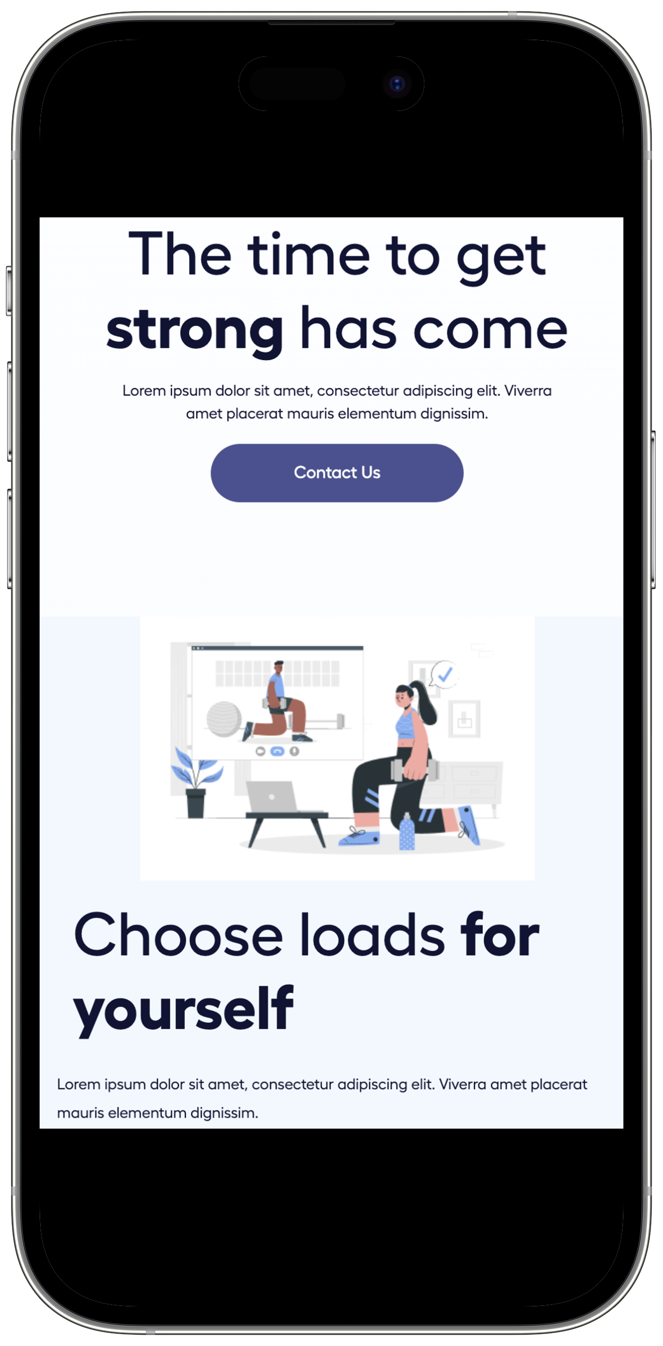
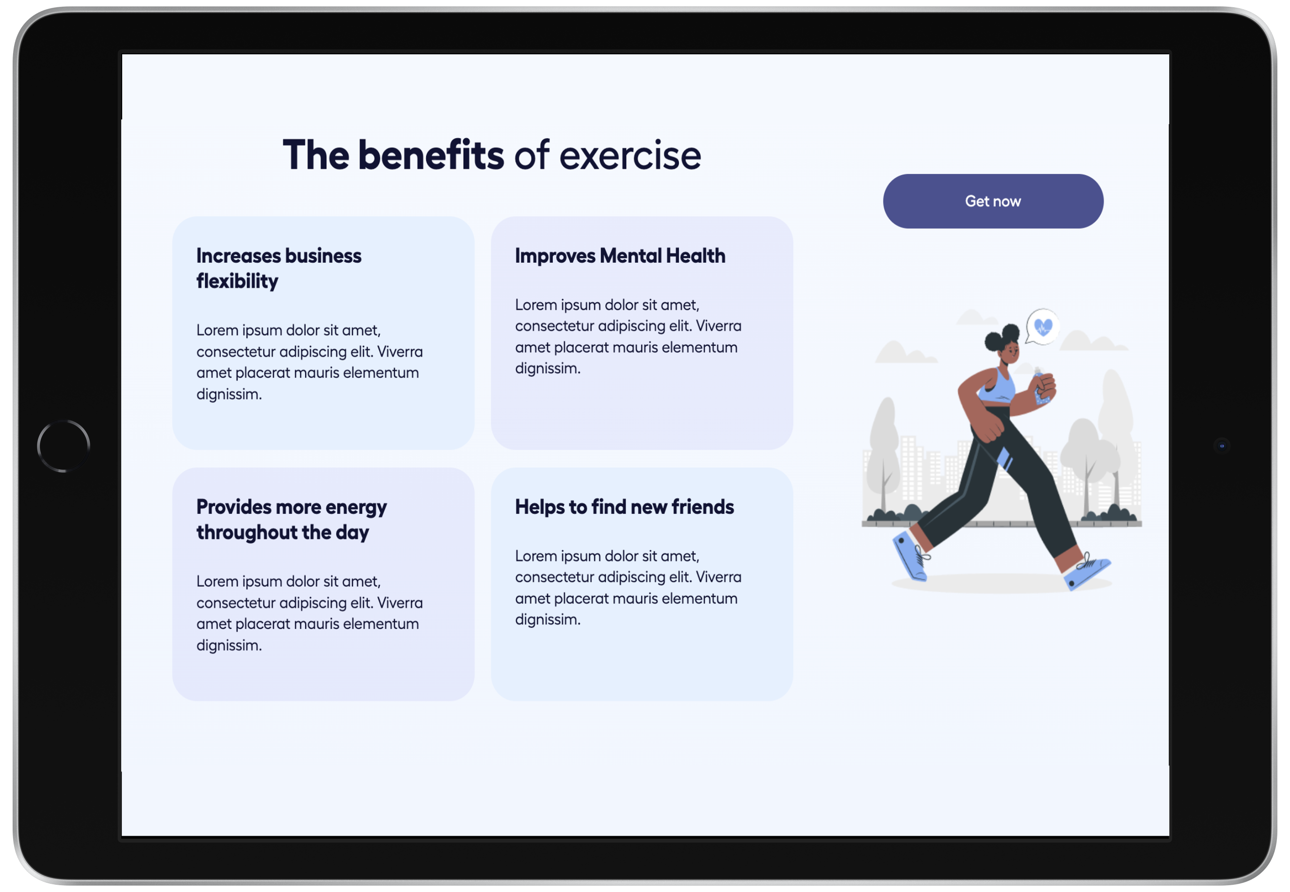
The goal from the beginning of the project was to start design and development from mobile responsive design. Then building from that foundation to tablet and desktop view. The brand identity, HTML form inputs, and buttons are to remain uniform throughout all device widths. The design was created to have an asthetically pleasing design, that is simple and mininmalistic, and easy to navigate for the user.
The foundation of this project began with mobile first development and design. Beginning the project with mobile first design and development laid a foundation to easily adjust for different devices using media queries. The process of developing began with all those aspects of the login page that would remain throughout all device sizes. These aspects are: form elements like inputs and buttons, brand idendity: logo, links, and images. These are the HTML building blocks that are then supported by CSS (colors, alignment, fonts, ect...). Once the HTML structure and CSS are finalized in mobile view, then adding media queries for tablet and desktop views.
The tablet and desktop view of the login page are adjusted through media query usage and making adjustments to the CSS and sometimes HTML structure. Through these adjustments in development the uniform, simplistic design is achieved and is asthetically manipulated for each device view. The image on the desktop view was achieved by adding the image into the HTML structure, hiding it with CSS for mobile and tablet view, and showing the image with CSS on desktop view only.
See the Pen Freemote | Max Strong Final by Kim (@kweincek) on CodePen.


